

It was already over 100 degrees, and it was only 11:00 AM! Seemed hard to believe it was a shivering 27 degrees just a few hours earlier when we started our trek down the north rim of the Grand Canyon at 5:00 AM.
A few years ago, we hiked rim-to-rim across the Grand Canyon. It is hard to imagine anything more majestic than the kaleidoscope of colorful red rock walls as the sun moves throughout the day in the canyon!
At the very bottom of the canyon there is a 500-foot long pedestrian bridge crossing the roaring Colorado River. It is not an option. To get back out of the canyon, you MUST cross the bridge.
Much like hiking across the Grand Canyon, building a SaaS bridge can be quite the journey. It is challenging just getting to the bridge. Then there is all the work to do after the bridge to get back to the top. By the way, the views from the top are fantastic! But, you MUST cross the bridge.
So let’s get started on the SaaS bridge journey.
Topline growth is a key driver, perhaps THE key driver, of a software as a service (SaaS) valuation methodology. There are lots of other levers too, like net dollar retention, gross margin, and EBITDA margin. But topline growth in gross revenues tend to be the biggest factor for capturing a solid SaaS revenue multiple.
Just to be clear, “topline” is gross revenues, not gross profit, not earnings. The term “growth” is a measure over time. The period for this discussion is somewhat irrelevant and could be month-over-month, or quarter-over-quarter, or even year-over-year. Let’s use month-over-month in our example.
The easiest and fastest way to look at month-over-month growth is to use a comparative income statement (P&L). A financial statement review like this won’t tell us much detail about what is driving the change from one month to the next. There could be a $100K increase in monthly recurring revenue (MRR) but the financial statement alone will not tell us if the growth was from new customer acquisition, existing customer expansions, contractions, or churn. The $100K increase could be $500K in new sales and $400K in existing customer churn. Or it could be nearly zero churn with a much lower and steady new sales growth. Huge difference.
This is where the SaaS bridge chart comes in. Also called a waterfall chart. A SaaS bridge chart takes into account the new sales for the period, the customer expanded revenues, any contractions for downgrading, and the customer churn for the period. At this point you are probably starting to realize these numbers are not particularly easy to come by. It is hard work to design a system of metrics to capture all this information. It can take several months and numerous systems to get an accurate view. It is an extremely valuable tool though, so please give it a shot.
What is being built will show where the business started the period, what revenue was gained during the period, what revenue was lost during the period, and where the business ended up. It will look something like this.
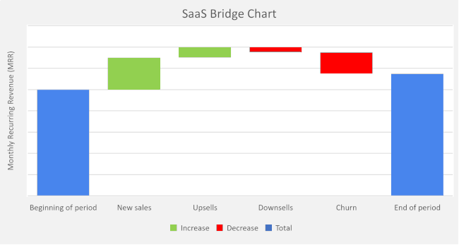
The vertical axis is the topline revenue axis. The units of measure can be monthly recurring revenue (MRR) or annual recurring revenue (ARR). Another common choice is committed monthly recurring revenue (CMRR) as this will get closer to the old school definition of sales bookings as long as it is annualized and not multi-year.
The horizontal axis includes the categories of revenue drivers. It is typical for these to be displayed in dollars, however it is insightful to use logo counts. Knowing the number of customers who downgraded plans or reduced user counts can shed light on the cause. Was it a few large downsells from enterprise customers spinning off a division? Or was it a ton of small downsells due to a product or plan deficiency?
Okay, so you have all your data pulled, and it is now charted in a bridge. What next? The analysis of the information is presented as either healthy or unhealthy. It is not so binary as to say the entire SaaS company is either healthy or unhealthy, but rather the components of the operating model are either healthy or unhealthy.
If a business has high new sales but is churning existing accounts like crazy, there are possible onboarding problems, quality issues, or even product functionality gaps. If the business has good topline growth but it is all driven from existing customer upsells, then there could be a market presence issue or weak sales capability.
Cohorts in SaaS businesses are always a struggle to analyze with all the different plan levels, user counts, processes, funnel entry points, and marketing origination sources. It is tough. Like hiking up out of a canyon.
Give it a shot. Adjust the units of measure and categories to fit your SaaS business. In addition to using a SaaS bridge chart as a diagnostic tool, you will find it a valuable asset in presenting to your board, potential investors and acquirers. Remember, the views from the top are fantastic.
Photo credit to Sonaal Bangera